The following 2 templates and 12 videos (with run times from about 2 to 7 minutes) will help you with your Blackboard homework on this unit.
Please scroll down past these templates and homework videos for an in-depth explanation of Correlation and Regression.
Template 1 Regression. How to convert the output of R’s summary of a linear model (lm) into a statistical report on regression. (Scroll FAR down, far past these HW videoes, to Question 5, for details on the example used to produced this template.
x = c(60, 65, 70, 71, 72, 72, 73, 74, 74);
y = c(150, 166, 185, 190, 185, 190, 195, 200, 205);
regression = lm(y~x);
plot(x,y);
abline(regression);
summary(regression);
# End of R Script

Template 2 Correlation. How to convert the output of R’s summary of a correlation test into a statistical report on correlation. (Scroll FAR down, far past these HW videoes, to Question 7, for details on the example used to produced this template.
x = c(60, 65, 70, 71, 72, 72, 73, 74, 74);
y = c(150, 166, 185, 190, 185, 190, 195, 200, 205);
plot(x,y);
cor.test(x,y);
# End of R Script

Note about template 2 (correlation). Because the correlation coefficient (cor = 0.9802685) was positive in the example above, the data had a positive correlation. This means the x and y data move in the same direction, so, in the example above, as height increased, so did weight. If the correlation coefficient (cor) was negative, it would mean that the x and y data move in opposite directions, so that as height increased, weight would decrease.
Note about cor.test. In R, the command $\text{cor.test(x,y)}$ will conduct the Pearson test for correlation (which is the correlation test we want). The R command $\text{cor.test(x,y, method = “pearson”) }$ also does the Pearson Correlation Test. Both commands do the same thing.
12 short videos to help with your Blackboard HW
Question 1.
Question 2.
Question 3.
Question 4.
Question 5.
Question 6.
Question 7.
Question 8.
Question 9.
Question 10.
Question 11.
Question 12.
Correlation and Regression
Question 1
If you scroll down to Question 1.1
there is a video which shows you how to
find the regression line equation and use it to make a prediction.
(x,y) data points and scatter plots
Suppose that $x$ and $y$ are two random variables on the same population.
Example 1.
The population = people living in New York
$x$ = the random variable that measures the heights of people living in New York
$y$ = the random variable that measures the weights of people living in New York
Suppose we have the following data on 9 New York residents (so it is a sample of size $n = 9).$
| Name (county of residence) | Height in inches (x) | Weight in pounds (y) |
|---|---|---|
| (1) Abe (Queens, NY) | 60 | 150 |
| (2) Ben (Orange, NY) | 65 | 166 |
| (3) Chris (Brooklyn, NY) | 70 | 185 |
| (4) Dan (Westchester, NY) | 71 | 190 |
| (5) Eric (Rockland, NY) | 72 | 185 |
| (6) Fred (Manhattan, NY) | 72 | 190 |
| (7) George (Nassau, NY) | 73 | 195 |
| (8) Henry (The Bronx, NY) | 74 | 200 |
| (9) Izzy (Staten Island, NY) | 74 | 205 |
We can combine $x$ and $y$ and write
$$(x, y) = \text{(height, weight)}$$
and represent the data as data points.
| Name (county of residence) | Data point (x, y) | Height in inches (x) | Weight in pounds (y) |
|---|---|---|---|
| (1) Abe (Queens, NY) | (60, 150) | 60 | 150 |
| (2) Ben (Orange, NY) | (65, 166) | 65 | 166 |
| (3) Chris (Brooklyn, NY) | (70, 185) | 70 | 185 |
| (4) Dan (Westchester, NY) | (71, 190) | 71 | 190 |
| (5) Eric (Rockland, NY) | (72, 185) | 72 | 185 |
| (6) Fred (Manhattan, NY) | (72, 190) | 72 | 190 |
| (7) George (Nassau, NY) | (73, 195) | 73 | 195 |
| (8) Henry (The Bronx, NY) | (74, 200) | 74 | 200 |
| (9) Izzy (Staten Island, NY) | (74, 205) | 74 | 205 |
We can plot the data points in a scatter plot

Here is the R script used to create the above scatter plot.
 x = c(60, 65, 70, 71, 72, 72, 73, 74, 74);
y = c(150, 166, 185, 190, 185, 190, 195, 200, 205);
plot(x,y,
xlab = "height in inches (x)",
ylab = "weight in pounds (y)",
main = "Weight vs Height \nData: a sample of 9 New York Residents",
pch = 16);
 # End of Script
Linear Regression
Recall from Algebra that the equation of a straight line is
$$y = mx + b$$
where
$$m = \text{ the slope } = \dfrac{\Delta y}{\Delta x}$$
and
$$b = \text{the $y$ intercept}$$
The equation $y = mx + b$ says there is a linear relationship between $x$ and $y$.
Now, consider the scatter plot we made out of the height weight data.

it looks like there is a linear relationship between $x$ and $y$, but that it isn’t perfect. In other words, it looks like somebody tried to draw a straight line with the points, but was sloppy, and so the points don’t perfectly line up.
We would like a formula that gives us the equation of the line that best fits the $(x, y)$ data.

The above figure shows three lines together with the NY Height Weight data points. The red line poorly fits the data. The blue line is a better fit. The black line is the best fit.
In statistics, we typically write the equation of the best fitting line as
$$\hat{y} = b_0 + b_1 x$$
We put the little triangular hat on top of $y$ to indicate that this is an approximation or a prediction of $y$ based on data from a sample, rather than $y$ itself.
How to find $b_0$ and $b_1$
Label the $n$ data points in the sample like this:
$(x_i, y_i)$ with $i = 1, 2, \ldots, n$
and for each $i, \ \ i = 1, 2, \ldots, n$ let
$$\hat{y}_i = b_0 + b_1 x_i$$
be the approximation (or prediction) of $y_i$ by $\hat{y}$.
In Example 1 above
$(x_1, y_1) = (60, 150)$ and $(x_6, y_6) = (72, 190)$
and if $b_0 = -67.4$ and $b_1 = 3.6$, then
$$\hat{y} = -67.4 + 3.6 x$$
so that
$\hat{y}_1 = -67.4 + 3.6 x_1$
$ = -67.4 + 3.6 (60)$
$= 148.6$
and
$\hat{y}_6 = -67.4 + 3.6 x_6$
$ = -67.4 + 3.6 (72)$
$= 191.8$
The difference between the actual value of $y_i$ and the prediction for $y_i$ given by $\hat{y}_i$ is
$$y_i – \hat{y}_i$$
$y_i – \hat{y}_i$ is called the residual error ( or the prediction error or just the residual) and is denoted by $e_i$. In other words
$$e_i = y_i – \hat{y}_i$$
or equivalently
$$ y_i = b_0 + b_1 x_i + e_i$$
which implies that:
$$e_i = y_i \ – \ (b_0 + b_1 x_i)$$
So, in Example 1 above
$e_1 = y_1 – \hat{y}_1 = 150 – 148.6 = 1.4$
$e_6 = y_6 – \hat{y}_6 = 190 – 191.8 = -1.8$
In statistics, the line that best fits the data points is the line that minimizes
$$ SSE = \sum_{i=1}^{n} e_{i}^{2} = \sum_{i=1}^{n} (y_i \ – \ ( b_0 + b_1x_i) )^{2} $$
That line is called the regression line.
Notation. SSE is an abbreviation for the sum of squared estimate of errors (or just the sum of the squared errors).
Sometimes the sum SSE is called the residual sum of squares (abbreviated RSS) and sometimes the sum is called the sum of the squared residuals (abbreviated SSR).
SSE, RSS, SSR are all are the same thing. It is confusing to have the same thing called by so many different names, but that is how the subject of statistics developed.
Using techniques from advanced calculus we can show that the SSE will be minimized if
$$b_1 = \dfrac{n \sum xy \ – \ \sum x \sum y}{n \sum x^2 \ – \ (\sum x)^2} $$
and
$$b_0 = \dfrac{\sum y \ – \ b_1 \sum x}{n} $$
where
$\sum x = \sum_{i=1}^{n} x_i$
$\sum y = \sum_{i=1}^{n} y_i$
$\sum xy = \sum_{i=1}^{n} x_i y_i$
$\sum x^2 = \sum_{i=1}^{n} x_{i}^{2}$
Note. A little bit of algebra applied to formula for $b_1$ allows us to write the formula for $b_1$ using the variance of $x$ and the covariance of $x ,y$:
$$b_1 = \dfrac{n \sum xy \ – \ \sum x \sum y}{n \sum x^2 \ – \ (\sum x)^2} = \frac{cov(x,y)}{var(x)}$$
where the covariance of $x, y$ is:
$$cov(x,y) = \dfrac{ \sum ^{n} _{i=1}(x_i – \bar{x})(y_i – \bar{y}) }{n-1} $$
and where the variance of $x$ = $var(x)$ = the standard deviation squared = $S_x^2$
$$var(x) = S_{x}^{2} = \dfrac{\sum_{i=1}^{n} (x_i – \bar{x})^2}{n-1}$$
For a discussion of $cov(x,y)$ see the bottom of this webpage. I won’t be using the formula $\frac{cov(x,y)}{var(x)}$ to calculate $b_1$ in these notes.
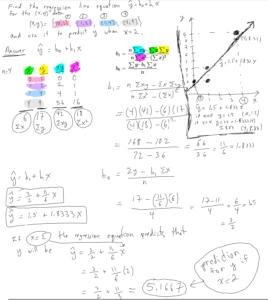
Finding the regression line for the data from Example 1
To find the regression line equation for the Height Weight data from Example 1 we need to calculate $b_0$ and $b_1$. It is easiest to do this calculation if we do the required sums in tabular form:

Then, we plug the above sums into the formulas (and recall that the sample size was $n = 9$):
$b_1 = \dfrac{n \sum xy – \sum x \sum y}{n \sum x^2 – (\sum x)^2} $
$ = \dfrac{(9) (117435) – (631)(1666)}{(9)(44415)- (631)^2} $
$= 3.601652$
and
$b_0 = \dfrac{\sum y – b_1 \sum x}{n} $
$= \dfrac{(1666) – (3.601652)(631)}{9} $
$= -67.40471$
So, the regression line equation (the line that best fits the data)
$$\hat{y} = b_0 + b_1 x$$
is
$$\hat{y} = -67.40471 + 3.601652 x$$
which, if we round $b_0$ and $b_1$ to the nearest tenth, is
$$\hat{y} = -67.4 + 3.6 x$$
We can do this calculation in R using the following script
x = c(60, 65, 70, 71, 72, 72, 73, 74, 74);
y = c(150, 166, 185, 190, 185, 190, 195, 200, 205);
lm(y~x);
# End of R Script
Here is the output of the above R script.

Note. the R command lm(y~x) tells R to apply the linear model $y_i = b_0 + b_1 x_i + e_i$ to the $(x, y)$ data. R does the regression analysis and outputs the values of $b_0$, under the word (Intercept) and $b_1$, under the letter x.
The following R script will plot the (x, y) data points along with the regression line.
x = c(60, 65, 70, 71, 72, 72, 73, 74, 74);
y = c(150, 166, 185, 190, 185, 190, 195, 200, 205);
plot(x,y,
xlab = "height in inches (x)",
ylab = "weight in pounds (y)",
main = "Weight vs Height \nData: a sample of 9 New York Residents",
pch = 16);
regr = lm(y~x); regr;
abline(regr, lwd = 3)
# End of R Script
Here is the graph from the output of the above R script. It shows the regression line
$$\hat{y} = -67.40471 + 3.601652 x$$
and the data points from Example 1.

Linear Regression Questions with Solutions
Question 1.1. Find the regression line equation $\hat{y} = b_0 + b_1 x$ for the following data:
$$(x,y) = \{ (0, 2),\ (1, 2),\ (1, 4),\ (4, 9) \}$$
and then use the regression line equation to predict $y$ if $x = 2$.
Then graph the data together with the regression line.
Note. We could also have written the above (x, y) data in the form:
x = 0, 1, 1, 4
y = 2, 2, 4, 9
Solution to Question 1.1 See video
The following video (10 minutes) shows you how to find the regression line equation and use it to predict $y$ if $x = 2$.
The following video (3 minutes 45 seconds) shows you how to graph the regression line equation.
Here is the work showing how to do Question 1.1
Question 1.2 Find the regression line equation $\hat{y} = b_0 + b_1 x$ for the following data:
$$(x,y) = \{ (1,1),\ (2,4),\ (2,5),\ (3,6),\ (3, 7)\}$$
Then graph the data together with the regression line.
Solution to Question 1.2
$n = 5$ and
$\sum x = 1 + 2 + 2 + 3 + 3 = 11$.
$\sum y = 1 + 4 + 5 + 6 + 7 = 23$.
$\sum xy = 1 + 8 + 10 + 18 + 21 = 58$.
$\sum x^2 = 1^2 + 2^2 + 2^2 + 3^2 + 3^2 = 1 + 4 + 4 + 9 + 9 = 27$.
$$b_1 = \frac{n \sum xy – \sum x \sum y}{n \sum x^2 – (\sum x)^2} =
\frac{5 (58) – (11)(23)}{5 (27) – (11)^2} = 2.642857$$
and
$$b_0 = \frac{\sum y – b_1 \sum x}{n} = \frac{23 – 2.642857(11)}{5} = -1.214285 $$
So the regression line’s equation $\hat{y} = b_0 + b_1 x$ is:
$$\hat{y} = -1.214285 + 2.642857 x \ \ \ \ \leftarrow \ answer$$
Here are the data points and the regression line plotted by hand.

Above. Graph of data points and regression line from Question 1.2 Note. To make plotting the regression line easier we rounded $b_0$ and $b_1$ to the nearest tenth.
Note on how to graph the regression line from Question 1.2
To graph a line we just need to find 2 points on that line. We can call those two points “guide points”. Any two guide points on a line will uniquely determine that line. However, if we find guide points at the ends of the data, the line we draw (by hand) will be more accurate. In Question 1 the minimum of the $x$ values was 1, so we used $x = 1$ for the x-coordinate of the “left end” guide point (the green one). In Question 1 the maximum of the $x$ values was 3, so we used $x = 3$ for the x-coordinate of the “right end” guide point (the red one).
Here is the graph for Question 1.2 as done by R.

The following R script finds the regression line equation from Question 1.2 and graphs the data together with the regression line.
x = c(1, 2, 2, 3, 3);
y = c(1, 4, 5, 6, 7);
regr = lm(y~x);
plot(x, y, xlab = 'x', ylab = 'y', grid(col = 'black'), asp = 1, lwd = 5);# asp = 1 makes the x and y scales the same
abline(regr, lwd = 3);
regr;
# End of Script
R outputs to the console:

Notice that under the word: (Intercept) is -1.214, which is $b_0$, the y-intercept; under the “x” is 2.643, which is $b_1$, the slope. These values agree with the values we found using the regression formulas.
NYC – Boston Temperature Correlation and Regression Line
Question 2 (NY City and Boston temperatures). In the table below, are the average monthly high temperatures for NY City ($x$) and Boston ($y$) in degrees (Fahrenheit). Find the equation of the regression line $\hat{y} = b_0 + b_1 x$ giving $b_0$ and $b_1$ to the nearest $10^{th}$. Then plot the data points and the regression line.
The formulas for $b_0$ and $b_1$ are given below.
\begin{align*}
b_1 &= \frac{n \sum xy – \sum x \sum y}{n \sum x^2 – (\sum x)^2} \\
b_0 &= \frac{\sum y – b_1 \sum x}{n}
\end{align*}
Average Monthly Temperatures given in degrees F
| Month | NY City (x) | Boston (y) |
|---|---|---|
| Jan | 38 | 36 |
| Feb | 42 | 39 |
| Mar | 50 | 45 |
| Apr | 61 | 56 |
| May | 71 | 66 |
| June | 79 | 76 |
| July | 84 | 82 |
| August | 83 | 80 |
| Sept | 75 | 72 |
| Oct | 64 | 61 |
| Nov | 54 | 52 |
| Dec | 43 | 41 |
Solution:
Step 1. Make table to find $\sum x, \sum y, \sum xy, \sum x^2$

Step 2. Find $b_1$ and $b_0$ and the regression line’s equation:
$$\begin{align*}
b_1 &= \frac{n \sum xy – \sum x \sum y}{n \sum x^2 – (\sum x)^2} \\
&= \frac{12 (46765) – (744) (706)}{12 (49142) – (744)^2}\\
&= 0.9930325 \approx 1.0 \\
b_0 &= \frac{\sum y – b_1 \sum x}{n} = \frac{(706) – 0.9930325 (744)}{12} \\
&= -2.734682 \approx -2.7 &\\
\hat{y} &= b_0 + b_1 x \\
\hat{y} &= -2.7 + 1.0 \ x \ \ \leftarrow \ \ \mathbf{answer}
\end{align*}$$
The regression line’s equation, $\hat{y} = -2.7 + 1.0 \ x$, suggests that the temperature in Boston is, typically, on average, about 2.7 degrees cooler than the temperature in NYC (because the y-intercept $b_0 = -2.7$ and the slope $b_1 = 1.0).
Step 3. Plot the data points and regression line.
We need two guide points to plot the regression line. It is best to choose one guide point to be on the left side of the graph and one to be on the right side. The left side of the graph is at about $x = 40$ (since the smallest value of $x = 38$) and the right side of the graph is at about $x = 80$ (since the largest value of $x = 83$).
Plugging $x = 40$ and $x = 80$ into the regression line’s equation:
$$\hat{y} = -2.7 + 1.0 \ x $$
yields the $y$ values of the two guide points:
$\begin{align*}
y &= -2.7 + 1.0 \ (40) = 37.3 \\
& \text{ left guide point} = (40, 37.3) \\
\\
y &= -2.7 + 1.0 \ (80) = 77.3 \\
& \text{ right guide point } = (80, 77.3)
\end{align*} $
Below is the regression line and data points as plotted in R. Obviously the temperature in the two cities have a strong positive correlation.

Using R to Plot Regression Line
The following R code will find the regression equation (for the NYC and Boston temperatures) and graph it, along with the data points.
x = c(38,42, 50, 61,71, 79, 84, 83, 75, 64, 54, 43); #NYC Temps
y = c(36, 39, 45, 56, 66, 76, 82, 80, 72, 61, 52, 41); #Boston Temps
regr = lm(y~x);
par(cex=.8);
plot(x, y, xlab = 'NYC temp (F)', ylab = 'Boston temp (F)', grid(col = 'black'), lwd = 5);
abline(regr, lwd = 3);
regr
# End of Script
R outputs to the console:

Notice that under the word: (Intercept) is -2.735, which is $b_0$, the y-intercept; under the “x” is 0.993, which is $b_1$, the slope. These values agree with the values we found using the regression line’s formulas.
Note about correlation. We say the data seems to be positively correlated if the data points look like they are sloping upward. We say the data seems to be negatively correlated if the data points look like they are sloping downward. Further down on this page is an entire section devoted to correlation.
Question 3.1 Suppose that the data is
$$(x,y) = \{ (0, 2), \ (0, 0),\ (3, 6), \ (2, 8) \}$$
Find the regression equation and plot it, along with the data points. Does $x$ and $y$ seem to be positively or negatively correlated?
Question 3.1 Solution. Regression Equation: $y = 1.407 + 2.074 \ x$. Positively correlated.
See Figure.

Question 3.2 Suppose that the data is
$$(x,y) = \{ (0, 8), \ (0, 6),\ (3, 4), \ (2, 3), \ (4, 3),\ (6,0) \}$$
Find the regression equation and plot it, along with the data points. Does $x$ and $y$ seem to be positively or negatively correlated?
Question 3.2 Solution. Regression Equation: $y = 6.727 – 1.091 \ x$. Negatively correlated.
See Figure:

Using the regression line equation to predict y given x
We can use the regression line equation to predict or estimate $y$ given $x$. The value for $y$ that is predicted by the regression equation should be thought of as an expected or average value.
We can also use the regression line equation to create “laws” or”rules” or formulas for various phenomena.
Question 4. Find the regression line equation for the data shown below and then use it to predict what the temperature is if a cricket makes 45 chirps in 15 seconds.
Let y = temperature in Fahrenheit degrees and let x = number of chirps a cricket makes every 15 seconds.
| obs | chirps per 15 seconds (x) | deg F (y) |
|---|---|---|
| 1 | 25 | 62.7 |
| 2 | 25 | 63.1 |
| 3 | 28 | 62.8 |
| 4 | 29 | 69.3 |
| 5 | 30 | 66.9 |
| 6 | 30 | 70.8 |
| 7 | 32 | 77.3 |
| 8 | 35 | 68.8 |
| 9 | 35 | 78.6 |
| 10 | 37 | 78.7 |
| 11 | 40 | 80.6 |
| 12 | 40 | 84.2 |
| 13 | 40 | 82.9 |
| 14 | 42 | 83.1 |
| 15 | 45 | 83.5 |
| 16 | 45 | 88.9 |
| 17 | 46 | 90.4 |
| 18 | 49 | 90.6 |
| 19 | 50 | 87.5 |
| 20 | 50 | 89.3 |
Answer to Question 4.
Using R (script below) we find that the regression line equation is
$$\hat{y} = 35.999 + 1.116 x$$
where $x$ is chirps per 15 seconds and $\hat{y}$ is temperature in degrees F.
We substitute $x$ = 45 into the regression equation and we get
$\text{predicted temp} = 35.999 + 1.116 x$
$= 35.999 + 1.116 (45)$
$ 86.219$ degrees F.
Here is a graph of the cricket temperature data together with the regression line. The red dot on the regression line is the point (45, 86.219), which corresponds to the predicted temperature for when a cricket chirping rate is 45 chirps per 15 seconds.

Here is the R script used to find the regression line equation and create the above graph, except for the red dot. The R commands to make the red dot are a little bit complicated, so I didn’t include them in this R script.
x = c(25, 25, 28, 29, 30, 30, 32, 35, 35, 37, 40, 40, 40, 42, 45, 45, 46, 49, 50, 50); #chirps per 15 sec
y = c(62.7, 63.1, 62.8, 69.3, 66.9, 70.8, 77.3, 68.8, 78.6, 78.7, 80.6, 84.2, 82.9, 83.1, 83.5, 88.9, 90.4, 90.6, 87.5, 89.3);
# ----------------------
regr = lm(y~x);
regr;
#-------------------------- plotting
n = length(x);
plot(x,y, pch = 16,
 xlab = "cricket chirps per 15 seconds",
 ylab = "temp in deg F",
 grid(col = "black"),
 main = paste("Temperature vs Cricket Chirps\n",n," observations made in Harriman State Park, NY, Summer 2020"));
 abline(regr, lwd = 3)
 #--------------------------------------------- # End of R Script
The above R script outputs the $b_0$ and $b_1$ for the regression equation.

For more about cricket chirps and temperature see Dolbear’s law 1.
Dolbert’s Law is sometimes given in the form:
$$T_F \approx 40 + N_{15}$$
where $T_F$ = the temperature in degrees Fahrenheit and $N_{15}$ is the number of chirps per 15 seconds.
If we were going to use our regression line equation to create a “law” about temperature and chirping it would probably be something like
$$T_F \approx 36 + 1.1 \cdot N_{15}$$
Note. The cricket temperature data used in the above Question is fairly realistic, but does not correspond to actual field observations. They are made up.
Statistical tests for linear regression
This section will show you how to conduct statistical tests to see if a sample provides statistically significant evidence that the regression line equation provides a statistically significant better estimate or prediction for $y$, given $x$, than simply estimating $y$ to always be $\bar{y}$, regardless of what $x$ is.
The mathematics underlying these statistical tests are beyond the scope of this course. However, it is easy to conduct these tests using statistical software like R. Which is how we will do them.
In this section you will learn how to conduct these statistical tests using R and then how to interpret and report these results.
In fact, that is how many, or even most, scientists do statistical analyses. They are not experts in mathematical statistics, but they know enough basic statistics to understand what the computer is telling them.
Question 5. For the height ($x$) weight ($y$) data from Example 1:
- Determine if the regression line equation is statistically significant at the $\alpha = .05$ significance level. Recall, that data provides statistical significance when the p-value < .05?
- Report these results in formal APA format (as if you were publishing a research article).
Note. The APA format is the format for reporting results suggested by the American Psychological Association.
Answer to Question 5.
Running the following R script outputs the summary of R’s regression analysis. We then can just copy the appropriate statistics into a “how to report” template.
x = c(60, 65, 70, 71, 72, 72, 73, 74, 74);
y = c(150, 166, 185, 190, 185, 190, 195, 200, 205);
regression = lm(y~x);
summary(regression)
#------------------------------------------- Plotting
plot(x,y,
xlab = "height in inches (x)",
ylab = "weight in pounds (y)",
main = "Weight vs Height \nData: a sample of 9 New York Residents",
pch = 16);
abline(regression, lwd = 3)
#---------------------------------------------
# End of R Script

How to report the results:
A simple linear regression was calculated to predict weight based on height. A significant regression equation was found (F(1,7) = 172.1, p = 3.485e-06) with an R-squared of .9609. Predicted weight is equal to -67.4047 + 3.6017 (height) pounds when height is measured in inches. Average weight increased 3.6017 pounds for each inch of height.
A simple linear regression was calculated to predict weight based on height. A significant regression equation was found (F(dfR, dfE) = Fstatistic, p = pvalue) with an R-squared of R^2. Predicted weight is equal to bo + b1 (height) pounds when height is measured in inches. Average weight increased b1 pounds for each inch of height.
You can use the above paragraph as a “how to report the results template”. Don’t forget to change the values of the statistics and the words that correspond to the particular data you are testing.
Important notes.
If the p-value > .05 (or whatever level of significance you are using) then we wouldn’t be able to report that a “significant regression equation was found”.
Notes about the regression hypothesis test (optional)
(1) The F-statistic (intuitive idea)
The F statistic is given by
$$F = \dfrac{MSR}{MSE}$$
where
$$MSR = \dfrac{ \sum_{i=1}^{n} (\hat{y}_i – \bar{y})^2 }{\text{df}_R} = \dfrac{ \sum_{i=1}^{n} (\hat{y}_i – \bar{y})^2 }{1}$$
$$MSE = \dfrac{ \sum_{i=1}^{n} (y_i – \hat{y}_i )^2 }{\text{df}_E} = \dfrac{ \sum_{i=1}^{n} (y_i – \hat{y}_i)^2 }{n-2}$$
and where:
The regression degrees of freedom $ = \text{df}_R = 1$
The error degrees of freedom $ = \text{df}_E = n-2$
The F statistic $F = \dfrac{MSR}{MSE}$ is very roughly the ratio of how “far” the regression line $\hat{y} = b_0 + b_1 x$ is from $\bar{y}$ (MSR) divided by how far the regression line is from the data (MSE). The F statistic gets larger the more steeply the regression line slopes (because that will make MSR bigger) and the closer the data is to the regression line (because that will make MSE smaller). A large F statistic is evidence that the regression line provides a better prediction for $y$ (given $x$) than predicting $y$ is always equal to $\bar{y}$ (regardless of $x$).
The following three graphs will help you to understand the F statistic. For all three of the graphs $n = 10$, the blue horizontal line is the line $y = \bar{y}$; the black line is the regression line $\hat{y} = b_0 + b_1x$. On the top of the graph is the value of the F statistic. In the three figures below, the 1 in F(1, 8) is because $\text{df}_R = 1$ and the 8 in F(1,8) is because $\text{df}_E = n-2 = 10 – 2 = 8$.
 In the following graph we have taken the y-values from the previous graph and made them closer to the regression line. As a result, the F statistic increases from 35.836 to 161.433.
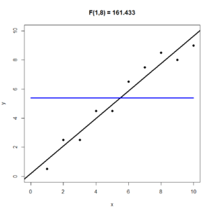
In the following graph we have taken the y-values from the previous graph and made them closer to the line $y = \bar{y}$. This forces the regression line to be closer to the line $y = \bar{y}$. As a result, the F statistic decreases from 161.433 to 10.807. It is also clear, that the regression line (black) isn’t much of an improvement over the horizontal line $y = \bar{y}$ (blue).

When we report our results we put in the report
$$F\left(\text{df}_R, \text{df}_E \right) = F(1, n-2) = \dfrac{MSR}{MSE}$$
which in this example worked out to:
$$F(1, 7) = 172.1$$
(2) If the p-value is less .0001 we usually write $p < .0001$ rather than something like p=3.485e-06 = $3.485 \times 10^{-6}$ = .000003485 (here R is using scientific notation).
(3) The R-squared statistic $R^2$ (intuitive idea).
$ SST =\sum_i (y_i-\bar{y})^2 = $ Sum of Squares Total
$ SSE =\sum_i (y_i – \hat{y}_i)^2 = $ Sum of Squares Error
$ SSR = \sum_i (\hat{y}_i – \bar{y})^2 = $ Sum of Squares Regression
Theorem $$SST = SSE + SSR$$
Proof. See any advanced statistics textbook.
The R-squared statistic is defined as
$$\text{R-squared } = \dfrac{SSR}{SST}$$
So, R-squared is the fraction of $SST$ which is due to, or explained by $SSR$
Intuitively, $SST$ measures, in some sense, how the $y$ data varies from its mean $\bar{y}$. We “split” that variation into to two parts. One part being explained by the regression line, the other part being explained by the data’s variation about the regression line. R-squared is the fraction of variation from $\bar{y}$ that can be explained by the regression line. If we multiply R-squared by 100 we get the percent of variation from $\bar{y}$ that can be explained by the regression line.
Correlation
Suppose $x$ and $y$ are random variables on the same population.
$x$ and $y$ moving in the same direction means as $x$ gets bigger, $y$ tends to get bigger and as $x$ gets smaller, $y$ tends to get smaller.
We say that $x$ and $y$ are positively correlated if $x$ and $y$ tend to move in the same direction. If $x$ and $y$ are positively correlated their linear regression line will have a positive slope.
Example of positive correlation. Suppose $x$ measures height and $y$ measures weight, like in Example 1. As a person’s height increases their weight usually increases, so we say that height and weight are positively correlated.
Moving in the opposite direction means as $x$ gets bigger, $y$ tends to get smaller and as $x$ gets smaller, $y$ tends to get bigger.
We say that $x$ and $y$ are negatively correlated if $x$ and $y$ tend to move in the opposite direction. If $x$ and $y$ are negatively correlated their linear regression line will have a negative slope.
Example of negative correlation. The classical “demand curve” from economics predicts that as the price $y$ of an item increases, the demand $x$ for the item will decrease. In other words, if we raise the price of something, people will buy less of it. So, according to the classical demand curve, price and demand are negatively correlated.
If $x$ and $y$ are neither positively nor negatively correlated, we say that they are uncorrelated.
Example of uncorrelated. GPA (grade point average) and height aren’t correlated because taller people don’t tend to have a higher (or lower) GPA than shorter people.
Some examples of positive correlation
- Height and weight.
The taller a person is, the more they tend to weigh. - Height and shoe size.
The taller a person is, the bigger their feet tend to be. - Temperature and ice cream sales.
As the temperature outside decreases, ice cream sales decrease. In this example the population would be “day of the year” and the random variables would be “temperature on this day” and “ice cream sales on this day”. - Age of car and number of repairs needed in the past 6 months.
As a car gets older, it tends to need more repairs. In this example the population would be cars and the random variables would “age of this car” and “how many repairs this car needed in the past 6 months”.
Some examples of negative correlation
- Temperature and heating costs.
As the temperature outside decreases, heating costs increase. In this example the population would be “day of the year” and the random variables would be “temperature on this day” and “heating costs for this day”. - Amount of alcohol drunk and scores on agility tests.
The more a person drinks, the less agile they are. - Tadpoles tail lengths and age.
As tadpoles get older their tails get shorter. - Altitude and air pressure.
As altitude increases the air pressure decreases.
Correlation does not imply causation
Just because two variables $x$ and $y$ are correlated it doesn’t mean that there is a causal relationship between them. In a causal relationship what you do to one variable effects, or causes a change in the other variable.
A causal relationship or a cause and effect relationship between two events is if the first event (the cause) causes the second event (the effect) to happen.
Example of correlation does not imply causation. It turns out that the divorce rate in Maine during the years 2000 to 2009 is extremely positively correlated (r = .99) with the per capita consumption of margarine during those years. Who knew?? It doesn’t seem like that amount of margarine that people consume in the US should have any effect on the divorce rate in Maine. Moreover, it is not like if we find out that more people are getting divorced in Maine, we develop a craving for margarine. For other examples of “spurious” correlations see the webpage http://www.tylervigen.com/spurious-correlations.
Example of correlation and a causal relationship. The amount of traffic and how long it takes to a commuter to drive to work are positively correlated because the more traffic there is, the longer it takes to drive to work. This is also causal relationship because an increase in traffic causes the commuter to drive more slowly.
Measuring the strength of the correlation
Pearson’s product-moment correlation $r$
The Pearson correlation coefficient $r$ measures the strength of the correlation.
$r =\dfrac{\sum^n _{i=1}(x_i – \bar{x})(y_i – \bar{y})}{\sqrt{\sum^n _{i=1}(x_i – \bar{x})^2} \sqrt{\sum^n _{i=1}(y_i – \bar{y})^2}} \ \ \text{Formula (1)}$
If we divide the numerator and denominator of Formula (1) by $n-1$ we get
$r =\dfrac{ \dfrac{ \sum ^n _{i=1}(x_i – \bar{x})(y_i – \bar{y}) }{n-1} }
{ \sqrt{ \dfrac{ \sum ^n _{i=1}(x_i – \bar{x})^2 }{n-1} } \sqrt{ \dfrac{ \sum ^n _{i=1}(y_i – \bar{y})^2 }{n-1} } } \ \ \text{Formula (2)}$
We can write Formula (2) as
$$r = \dfrac{cov(x,y)}{S_x \cdot S_y} \ \ \text{Formula (3)}$$
because the sample covariance of $x$ and $y$ is:
$$cov(x,y) = \dfrac{ \sum ^n _{i=1}(x_i – \bar{x})(y_i – \bar{y}) }{n-1} $$
and because the sample standard deviations of $x$ and $y$ are
$$S_x = \sqrt{ \dfrac{ \sum ^n _{i=1}(x_i – \bar{x})^2 }{n-1} } $$
and
$$S_y = \sqrt{ \dfrac{ \sum ^n _{i=1}(y_i – \bar{y})^2 }{n-1} } $$
For more details about covariance see the bottom of this page.
A bit of algebra will turn Formula (1) into:
$r = \dfrac{n \sum xy – \sum x \sum y}{\sqrt{n \sum x^2 – (\sum x)^2} \ \sqrt{n \sum y^2 – (\sum y)^2}} \ \ \text{Formula (4)}$
You can use any of the above 4 formulas to calculate $r$. They will all give you the same result.
The Formulas (1), (2), and (3) are better for understanding $r$ and easier to remember. Mathematically speaking, Formula (3) is quite beautiful. However, Formula (4) is probably faster if you want to calculate $r$ by hand because you don’t have to calculate $x_i – \bar{x}$ and $y_i – \bar{y}$ like you do with Formulas (1), (2), and (3).
Important facts about the correlation coefficient $r$:
- $r$ is always between -1 and 1.
- If $r = -1$ all the data points lie perfectly on a line with negative slope.
- The closer $r$ is to -1 the stronger the negative correlation.
- If $r$ is close to zero, then $x$ and $y$ are uncorrelated.
- The closer $r$ is to +1 the stronger the positive correlation.
- If $r = +1$ all the data points lie perfectly on a line with positive slope.
The mathematics of why the correlation coefficient $r$ is defined the way it is, is beyond the scope of this course. However, if you are interested in learning more about why the correlation coefficient is defined the way it is, a good place to start is the section at the bottom of this page on covariance, or the Wikipedia article on the Pearson correlation coefficient.
Important note about $r$ and R-squared.
The Pearson correlation coefficient $r$ is always between -1 and +1. It tells you the strength of the correlation and whether the correlation is positive or negative. The closer $r$ is to -1 the more negatively correlated the $x$ and $y$ data is. The closer $r$ is to +1 the more positively correlated the $x$ and $y$ data is.
R-squared (coefficient of determination) measures the fraction of $\sum_i (y_i – \bar{y})^2$ that is predictable (or explainable) from the regression line equation $\hat{y} = b_0 + b_1\ x.$
$SST = \sum_i (y_i – \bar{y})^2$ is a measure of the variation in $y$.
Numerically, R-squared $ = r^2$
Question 6.
Calculate the Pearson correlation coefficient $r$ for the Weight Height data from Example 1.
| Name (county of residence) | Height in inches (x) | Weight in pounds (y) |
|---|---|---|
| (1) Abe (Queens, NY) | 60 | 150 |
| (2) Ben (Orange, NY) | 65 | 166 |
| (3) Chris (Brooklyn, NY) | 70 | 185 |
| (4) Dan (Westchester, NY) | 71 | 190 |
| (5) Eric (Rockland, NY) | 72 | 185 |
| (6) Fred (Manhattan, NY) | 72 | 190 |
| (7) George (Nassau, NY) | 73 | 195 |
| (8) Henry (The Bronx, NY) | 74 | 200 |
| (9) Izzy (Staten Island, NY) | 74 | 205 |
Answer to Question 6.
We will use Formula (3).
It is easiest to calculate the sums if we set up a table like the one below.

Then we substitute the sums into Formula (4) for $r$. We get:
$r = \dfrac{n \sum xy – \sum x \sum y}{\sqrt{n \sum x^2 – (\sum x)^2} \ \sqrt{n \sum y^2 – (\sum y)^2}} $
$ = \dfrac{(9) (117435) – (631)(1666)}{\sqrt{(9) (44415) – (631)^2} \ \sqrt{(9) (310756) – (1666)^2}} $
$=0.980268538$
Using R to calculate $r$.
Here is one way to calculate $r$ in R. It uses Formula (3)
$$r = \dfrac{cov(x,y)}{S_x \cdot S_y}$$
x = c(60, 65, 70, 71, 72, 72, 73, 74, 74);
y = c(150, 166, 185, 190, 185, 190, 195, 200, 205);
r = cov(x,y)/(sd(x)*sd(y))
# End of R Script
R outputs

Here is another way to calculate $r$ in R. It uses R’s built in cor.test function which will conduct a hypothesis test to determine if the sample provides statistically significant evidence that $x$ and $y$ are correlated. As part of that hypothesis test it will calculate $r$.
x = c(60, 65, 70, 71, 72, 72, 73, 74, 74);
y = c(150, 166, 185, 190, 185, 190, 195, 200, 205);
cor.test(x,y, method = "pearson");
# End of R Script
R outputs

Under the word cor is R’s calculation of the Pearson correlation coefficient $r$
$$0.9802685$$
which agrees with our by-hand calculation of $r$.
Some scatter plots with their correlation coefficients $r$
The following scatter plots will help you to understand the correlation coefficient $r$.

Statistical tests for correlation
In this section we will use R to conduct a hypothesis test (or statistical test) for correlation.
Question 7. For the height ($x$) weight ($y$) data from Example 1, conduct a hypothesis test to determine if the data provides statistically significant evidence (at the $\alpha = .05$ significance level) that height and weight are correlated. Report your results in APA format.
Answer to Question 7.
The following R script carries out the correlation test. Then we copy and paste into a “how to report” template.
x = c(60, 65, 70, 71, 72, 72, 73, 74, 74);
y = c(150, 166, 185, 190, 185, 190, 195, 200, 205);
cor.test(x,y, method = "pearson");
# End of R Script
How to report the results (APA style):
A Pearson product-moment correlation coefficient was computed to assess the relationship between an individual’s height and their weight. There was a positive correlation between the two variables, r(7) = .9802685, p = 3.485e-06. A scatter plot summarizes the results (Figure 1) Overall, there was a strong, positive correlation between height and weight. Increases in height were correlated with increases in weight.
A Pearson product-moment correlation coefficient was computed to assess the relationship between height and weight. There was a positive/negative correlation between the two variables, r(df) = correlation_coef_r, p = p-value. Overall, there was a strong, positive/negative correlation between height and weight. Increases in height were correlated with increases/decreases in weight.
You can use the above paragraph as a “how to report the results template”. Don’t forget to change the values of the statistics and the words that correspond to the particular data you are testing.
Don’t forget:
r is positive when there is positive correlation.
r is negative when there is negative correlation.
For example. if r is negative, then there is negative correlation. In which case, increases in height would be correlated with decreases in weight.
Figure 1.
Figure 1. was copied from the output of the regression test (Question 5).
Notes.
- r(7) because there are n-2 = 9-2 = 7 degrees of freedom in the correlation test.
- Typically, if the p-value is less than .0001 we put p < .0001 rather than something like 3.485e-06 which is scientific notation for .000003585.
Two quick questions on correlation and $r$
Choose the answer most likely to be correct.
(Q1) Which of the following is most likely to be true about the data presented in the scatter plot shown below?

(a) strong negative correlation: $r = – 0.9$
(b) small negative correlation: $r = -0.3$
(c) not correlated: $r = 0.1$ ($r$ near zero)
(d) small positive correlation with $r = +0.3$
(e) strong positive correlation with $r = +0.9$
The correct answer is (e) because the data slopes upward and clearly looks linear (like a line).
(Q2) A researcher discovers that the price of pizza and the cost of a subway ride
is strongly positively correlated. This means that a rise in the cost of a slice of pizza
(a) will cause a rise in the price of a subway ride.
(b) is associated with the price of a subway ride increasing.
(c) will cause the price of riding the subway to decrease.
(d) is associated with the price of a subway ride decreasing.
The correct answer is (b). Answer (a) is wrong because correlation does not imply a cause and effect relationship.
Qualitative Correlation Questions with Answers
Qualitative Correlation Questions. Chose the best answer. Answer key is after the last question.
(Q1) Suppose that the number of ticks carried by deer in the spring is positively correlated
with the average winter temperature. This means:
(a) if the average winter temperature increases, we should expect that the number of ticks
carried by deer will increase in the spring.
(b) if the average winter temperature increases, we should expect that the number of ticks
carried by deer will decrease in the spring.
(c) knowing if the average winter temperature has increased will not allow us to better predict whether there will be an increase, or decrease, in the number of ticks carried by dear in the spring.
(Q2) Suppose that the number of mosquitoes is positively correlated with the number of pools of stagnant water. This means:
(a) the more pools of stagnant water, the less mosquitoes.
(b) the more pools of stagnant water, the more mosquitoes.
(c) knowing that the number of pools of stagnant water has increased will not help us to predict whether the number of mosquitoes has increased or decreased.
(Q3) Suppose that the number of mosquitoes is negatively correlated with the amount of malathion sprayed in the area. This means:
(a) the more malathion sprayed, the more mosquitoes.
(b) the more malathion sprayed, the fewer mosquitoes.
(c) knowing the amount of malathion sprayed will not help us to predict if the number of mosquitoes will increase or decrease.
(Q4) Suppose that the number of cancers per 1,000 residents is positively correlated with the amount of malathion sprayed in the area. This means:
(a) the more malathion sprayed, the more cancers.
(b) the more malathion sprayed, the fewer cancers.
(c) knowing the amount of malathion sprayed will not help us to predict whether the number of cancers will increase or decrease.
(Q5) Suppose that the number of cancers per 1,000 residents is uncorrelated with the amount of malathion sprayed in the area. This means:
(a) the more malathion sprayed, the more cancers.
(b) the more malathion sprayed, the fewer cancers.
(c) knowing the amount of malathion sprayed will not help us to predict whether the number of cancers will increase or decrease.
(Q6) Suppose that the population of the USA is positively correlated with the population of India. This means:
(a) decreases in the US population will cause the population of India to increase.
(b) increases in the US population will cause the population of India to increase.
(c) as the population of the US increases, the population of India also increases.
(Q7) Suppose that the number blue flowers found in meadows in Bear Mountain State Park
is negatively correlated with the number of red flowers found in the same meadows.
This means:
(a) the red flowers cause the blue flowers to grow poorly.
(b) the fewer red flowers we find in a Bear Mountain meadow, the more blue flowers we should expect to find in that meadow.
(c) the fewer red flowers we find in a Bear Mountain meadow, the fewer blue flowers we should expect to find in that meadow.
(Q8) Suppose that the number arctic foxes and the number of snowy owls in localities are positively correlated. This means:
(a) the arctic foxes cause the number of snowy owls to increase.
(b) the fewer arctic foxes in a locality, the more snowy owls.
(c) the fewer arctic foxes in a locality, the fewer snowy owls as well.
(Q9) Suppose that the number of cigarettes smoked is positively correlated with the
probability of developing lung disease. This means:
(a) smoking cigarettes causes lung disease.
(b) people who smoke more cigarettes are more likely to develop lung disease than people who smoke less cigarettes.
(c) people who don’t smoke won’t develop lung disease.
(Q10) Suppose that the number of hours that a student spends using their cell phone is negatively correlated with their GPA. This means:
(a) playing with a cell phone causes students’ GPA to decrease.
(b) students who spend fewer hours using their cell phone tend to have higher GPA’s.
(c) students who spend fewer hours using their cell phone tend to have lower GPA’s
Answer Key for the above Qualitative Correlation Questions.
(Q1) a.
(Q2) b.
(Q3) b.
(Q4) a.
(Q5) c.
(Q6) c.
(Q7) b.
(Q8) c.
(Q9) b.
(Q10) b.
Remember: correlation does not imply causation.
This is why, for example, in (Q9) the answer (a) would be incorrect.
Covariance
The formula for the sample covariance is
$$cov(x,y) = \dfrac{ \sum ^{n} _{i=1}(x_i – \bar{x})(y_i – \bar{y}) }{n-1} $$
The $cov(x,y)$ is used to estimate the population covariance of $x$ and $y$ which is denoted $C(x,y)$. For a population of size $N$ the formula for $Cov(x,y)$ is:
$$Cov(x,y) = \dfrac{ \sum ^{N} _{i=1} (x_i – \mu_x)(y_i – \mu_y) }{N} $$
Note. The covariance of $x$ with itself is the variance2 of $x$ because $Cov(x,x) = \sigma_{x}^{2}.$
Usually, when we say covariance we will mean the sample covariance $cov(x,y)$.
The covariance of $x$ and $y$ is a sort of measure of the degree to which $x$ and $y$ consistently move in the same direction, or to which the data points $(x, y)$ form a non-horizontal straight line.
The “normalized” covariance is the correlation coefficient
$$r = \dfrac{cov(x,y)}{S_x \cdot S_y}$$
The picture below describes some of the geometry of covariance by considering a particular data set $(x, y) = (1, 1), (2, 3), (3, 1), (4, 6), (5, 5), (6,1)$

In the example shown above, if a data point is in a green region, its contribution to $cov(x,y)$ will be positive. If the data point is in the red region, its contribution to $cov(x,y)$ will be negative. If $cov(x,y)$ is close to zero it means that the positive contributions to cov(x,y) cancelled with the negative contributions (i.e., the data points were in some sense “equally” distributed in the red and the green regions) and/or data points were close to the vertical line $x = \bar{x}$ or the horizontal line $y = \bar{y}$.
Here is the calculation of $cov(x,y)$ for the data from the above figure
$$(x, y) = (1, 1), (2, 3), (3, 1), (4, 6), (5, 5), (6,1)$$
For the above data: $\bar{x} = 3.5$ and $\bar{y} = 2.5$

Here is how to do that same calculation of $cov(x,y)$ in R.
x = c(1,2,3,4,5,6);
y = c(1, 2,1,6,5,1);
cov(x,y);
 # End of R Script

For more about covariance, see Wikipedia.
Footnotes
- Dolbear, Amos (1897). “The cricket as a thermometer”. The American Naturalist. 31 (371): 970–971. doi:10.1086/276739. Retrieved 1 December 2020.
-
The population standard deviation of $x$ is denoted by $\sigma_x$. For a population of size $N$ the formula for $\sigma_x$ is:
$$\sigma_x = \sqrt{\dfrac{\sum_{i=1}^{N} (x_i – \mu_x)^2}{N}}$$
The standard deviation is a measure of the average amount of variation in $x$.
The population variance of $x$ is $\sigma_{x}^{2}$. So,
$$\sigma_{x}^{2} = \dfrac{\sum_{i=1}^{N} (x_i – \mu_x)^2}{N}$$
The sample standard deviation of $x$ is denoted by $S_x$. For a sample of size $n$ the formula for $S_x$ is:
$$S_x = \sqrt{\dfrac{\sum_{i=1}^{n} (x_i – \bar{x})^2}{n-1}}$$
The sample variance is $S_{x}^{2}$. So,
$$S_{x}^{2} = \dfrac{\sum_{i=1}^{n} (x_i – \bar{x})^2}{n-1}$$