These three videos will help you do your Blackboard Homework.
First Video
Question 1. How to use a Probability Density Histogram.
Question 2. Frequency Histogram.
Second Video
Question 3. Relative frequency histogram.
Third Video
Question 4. Finding the probability density.
Histograms
Note. Some of the mathematics on this page may not display properly on your cell phone. If that is the case, use landscape mode, or better yet, view this page on a laptop or computer.
Note. You might prefer to start this material by watching the videos that accompany Questions 1, 2, and 3 below. Histograms are a difficult to describe in words, but easy to understand in pictures and videos.
At the bottom of this page are R scripts to create histograms.
A histogram is a bar chart created by partitioning the data into classes. The classes are sometimes called bins and consist of a sequence of adjacent intervals which cover the range of the data. In a histogram the height of the bar above a class is proportional to the amount of data in that class.
You should think of the data as coming from some sample of size $n$ to which we applied some random variable, e.g., $x$.
The class start is where the first class starts. The class width is how wide the classes (the intervals) are. The frequencies, denoted by $f$, are the amounts of data in each class. When we want to be precise, the frequency of the $i^{th}$ class will be denoted $f_i$. The frequencies are sometimes called the counts.
There are three types of histograms.
- Frequency Histogram. The height of the bars are the frequencies. If you sum up the frequencies of all the classes you get $n$, i.e., $$n = \sum_i f_i$$
- Relative Frequency histogram. The height of the bars are the relative frequencies (the class probabilities): $$\text{relative frequency = class probability} = \dfrac{f_i}{n}$$
The relative frequency $\dfrac{f_i}{n}$ is the probability that a randomly selected member of the sample will be from the $i^{th}$ class. If you sum up the relative frequencies you get 1. Relative frequencies are often written as a percent. - Probability Density Histogram. The height of the bars are the probability densities. The probability density is the class probability divided by the class width:
$$\dfrac{\text{class probability}}{\text{class width}} = \dfrac{f_i/n}{\text{class width}} = \dfrac{f_i}{n \times \text{ class width }} $$
In a probability density histogram the area of the bar gives the class probability. The probability density is typically expressed as a decimal and is sometimes just called the “density”.
The term probability density is used because in chemistry and physics
$$\text {density} = \dfrac{\text{mass}}{\text{volume}}$$
Mathematicians think of probability as being a measure very similar to mass and
volume is the 3 dimensional analogue of length (or width). Hence,
$$\text {probability density} = \dfrac{\text{probability}}{\text{length}}$$
See our unit on measure and probability for more about measures and probability.
The best way to understand histograms is to learn how to construct them
Question 1. Draw the frequency histogram for the data x = 6, 4, 6, 4, 4, 2 having a class start at x = 1 and a class width of 2.
Solution to Question 1:

Solution to Question 1 (video):
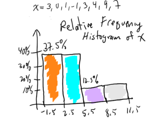
Question 2. Draw the relative frequency histogram for the data x = 3, 0, 1, -1, 3, 4, 9, 7. Use a class start of x = -1.5 and class width of 3.
Solution to Question 2.
Solution to Question 2 (video):
Question 3. Draw the probability density histogram for the data:
x = 5, 4, 5, 6, 5, 3, 1, 0, 9, 7
Use a class start of x = -0.5 and class width of 2.
Solution to Question 3.

Notes about Question 3. In a probability density histogram the area of a bar gives the probability of the corresponding class.
For example, in the Figure above, the area of the yellow bar is 40% because 40% of the data from the sample has a value between 3.5 and 5.5 (i.e., 40% of the data is in the class that goes from 3.5 to 5.5). The height of the yellow bar is the probability density for that class:
$\text{probability density for that class} = \dfrac{\text{percent of data in that class} }{\text{that class width}}$
$ = \dfrac{40\%}{2} =\dfrac{0.40}{2} = 0.2 = 0.200$
Solution to Question 3 (video):
Question 4. Suppose x = 8, 9, 3, 4, 4, 4, 3, 1, 1, 1. For a class start of 0.5 and class width of 3, what is the frequency (or count) of the class 3.5 to 6.5?
Answer to Question 4. We don’t have to draw the entire frequency histogram. We just have to find the frequency for the class [3.5, 6.5]. We order the data:
x = 1, 1, 1, 3, 3, 4, 4, 4, 8, 9
Then between 3.5 and 6.5 we have: {4, 4, 4}. So, the frequency is 3.
Question 5. Same as Question 4, except find the relative frequency of the class 3.5 to 6.5.
Answer to Question 5. Since n = 10 (if we count the data in x we get 10) and $f = 3$ we have:
$$\text{relative frequency} = \dfrac{\text{f}}{n} = \dfrac{3}{10} = 0.3$$
Question 6. Same as Question 4, except find the probability density of the class 3.5 to 6.5.
Answer to Question 6. Since n = 10, $f = 3$, and the class width = 2, we have:
$$\text{probability density} = \dfrac{f/n }{\text{class width}} = \dfrac{3/10 }{2}= \dfrac{0.3}{2} = 0.15$$
Question 7. Based on the frequency histogram for x, shown below, what is the relative frequency of the class [5.5, 7.5]? Give your answer as a decimal.
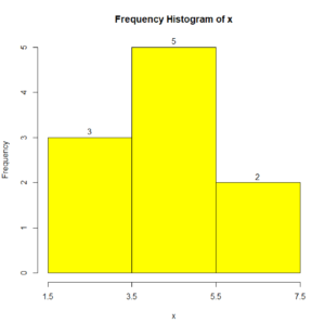
Answer to Question 7.
The frequency $f$ of the class [5.5, 7.5] is 2 (just look at the top of the bar). The sample size $n$ is just the sum of the frequencies. So, $n = 3 + 5 + 2 = 10$. So:
$\text{relative frequency of the [5.5, 7.5] class} = \dfrac{f}{n} = \dfrac{2}{10} = 0.2$
Question 8. Based on the frequency histogram for x from Question 7, what is the probability density of the class [1.5, 3.5]? Give your answer as a decimal.
Answer to Question 8.
The frequency $f$ of the class [1.5, 3.5] is 3 (just look at the top of the bar). The sample size $n$ is just the sum of the frequencies. So, $n = 3 + 5 + 2 = 10$. So:
$\text{probability density of the [1.5, 3.5] class} = \dfrac{\text{probability of the [1.5, 3.5] class}}{\text{width of the [1.5, 3.5] class}}$
$= \dfrac{\dfrac{f}{n}}{\text{class width}} = \dfrac{\dfrac{3}{10}}{2}$
$= \dfrac{.3}{2} = 0.15$
Question 9. Based on the frequency histogram for x from Question 7, what fraction of the sample had an x value of between 3.5 and 7.5? Give your answer as a decimal.
Answer to Question 9. As we’ve calculated in Questions 7 and 8, the sample size $n = 10$. By looking at the histogram, we see the amount of data between 3.5 and 7.5 is 5 +2 = 7 (just look at the tops of the bars). So, the fraction of data between 3.5 and 7.5 is $\dfrac{7}{10} = 0.7$. In other words, the fraction of the sample between 3.5 and 7.5 is 0.7.
Question 10. Based on the probability density histogram for x, shown below, what fraction of the sample had an x value between 2.5 and 8.5? Give your answer as a decimal rounded to the nearest thousandth (3 decimal places).
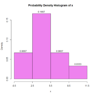
Note. In the above histogram, the y axis label “Density” means “Probability Density”
Answer to Question 10.
$$\text{class probability density} = \dfrac{\text{class probability}}{\text{class width}}$$
So
(class probability) = (class probability density) $\times$ (class width)
= (height of bar) $\times$ (width of bar)
= (area of bar)
In other words, in a probability density histogram:
the area of the bar gives the class probability
See footnote1 about probability vs “fraction of sample”.
Note. The bar’s widths are all 3. For example, 5.5 – 2.5 = 3.
(probability of the class 2.5 to 5.5) = area of the bar
= (bar’s height)(bar’s width)
= (0.1667)(3)
= 0.5001
(probability of the class 5.5 to 8.5) = area of the bar
= (bar’s height)(bar’s width)
= (0.0667)(3)
= 0.2001
So, probability of x being in 2.5 to 8.5 = (0.5001) + (0.2001) = 0.7002
Which rounded to the nearest thousandth is: 0.700
In other words about 70% of the sample has an x value between 2.5 and 8.5.
Which histogram type (frequency, relative frequency, or probability density) should you use in papers you are writing?
It depends.
If you are displaying data about a particular sample, you should probably use a frequency histogram.
If you want to compare the histograms of two samples or if your histogram is about the population, you should probably use a relative frequency histogram.
Probability density histograms are used when we want to compare the histogram of a sample with a continuous distribution (which you will learn about later).
However, in some sense, it doesn’t matter which type of histogram you use. All three types will have the same shape for the same data and the most important thing that histograms convey is the shape of the distribution.
In the green and violet histograms below, the data, class start, and class width are the same:
x = 5, 4, 5, 6, 5, 3, 1, 0, 9, 7
class start = -0.5
class width = 3
As a result, the frequency histogram (green) and the probability density histogram (violet) have the exact same shape.

For more information on histograms see Wikipedia:
https://en.wikipedia.org/wiki/Histogram
R Scripts for Histograms
Frequency Histograms in R
It is very easy to have R produce a frequency histogram.
Here is a 2 line script to make a frequency histogram using the data in Question 1.
# Simplest Frequency Histogram Script
x = c(6, 4, 6, 4, 4, 2)
hist(x)
Here is the frequency histogram created by the above R script:

The above script is extremely simple. It just has the data “x” and the histogram command “hist(x)” which creates a frequency histogram of x using the histogram function’s default settings.
The histogram it produces is fine, but it doesn’t satisfy the parameters specified in Question 1, namely that the class start be x = 1 and the class width = 2.
It is important to realize that the same data can produce different looking histograms depending on the parameters used. By changing the parameters of the histogram you can emphasize different aspects of the data.
With a slight modification to the above script, we can add a custom title to the histogram and choose the color of the bars.
# Custom Title and Color Frequency Histogram Script
x = c(6, 4, 6, 4, 4, 2)
hist(x, col = "blue",
       main = "My custom title for my histogram of x")
Here is the frequency histogram created by the above R script:

Using R to do Question 1.
Here’s Question 1 again:
Question 1. Draw the frequency histogram for the data x = 6, 4, 6, 4, 4, 2 having a class start at x = 1 and a class width of 2.
To have R to automatically create a frequency histogram with class start 1, class width 2, and frequencies on top of the bars, requires a more complicated script. However, once we have the script, we can easily modify and reuse it.
Here is the R script to solve Question 1:
# Custom class start, width, color, title Frequency Histogram Script

x = c(6, 4, 6, 4, 4, 2)
classStart  = 1
classWidth  = 2
#--------------------------------------------
classEnd = classStart + classWidth*ceiling((max(x)- classStart  )/classWidth);
#--------------------------------------------
h = hist(x,
 main="Prof McCarthy's Frequency Histogram of x",
 xlab="x values",
 xlim=c(classStart  , classEnd),
 col="cyan",
 border="black",
 breaks=seq(classStart  ,classEnd, classWidth ),
 xaxt='n'
);
#--------------------------------------------
text(h$mids,h$counts,labels=h$counts, adj=c(0.5, -0.5));
axis(side=1, at=seq(classStart  ,classEnd, classWidth),
  labels=seq(classStart  ,classEnd, classWidth));
Here is the output of the above script. Notices that it matches our solution of Question 1.
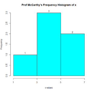
Hand drawn solution to Question 1.
Relative Frequency Histograms in R
Creating a relative frequency histogram in R is not difficult if you use the (free) package called “lattice” which extends the graphics capabilities of R. See:
https://cran.r-project.org/web/packages/lattice/
However, in this course, we will avoid using external R packages. So, we’ll not worry about having R make relative frequency histograms for us.
Probability Density Histograms in R
Using R to do Question 3.
Here’s Question 3 again:
Question 3. Draw the probability density histogram for the data:
x = 5, 4, 5, 6, 5, 3, 1, 0, 9, 7
Use a class start of x = -0.5 and class width of 2.
Here is the R script to solve Question 3:
x = c(5, 4, 5, 6, 5, 3, 1, 0, 9, 7)
classStart  = -0.5
classWidth = 2
#--------------------------------------------
classEnd = classStart + classWidth*ceiling((max(x)- classStart  )/classWidth)
classEnd
#--------------------------------------------
h = hist(x,
 main="Prof McCarthy's Probability Density Histogram of x",
 xlab="x values",
 xlim=c(classStart  , classEnd),
 col="cyan",
 border="black",
 breaks=seq(classStart  ,classEnd, classWidth ),
 xaxt='n',
 freq=FALSE
);
text(h$mids,h$density,labels= round(h$density,4), adj=c(0.5, -0.5));
axis(side=1, at=seq(classStart  ,classEnd, classWidth),
  labels=seq(classStart  ,classEnd, classWidth));
Here is the probability density histogram output by the above script:

Notice that the above Probability Density Histogram matches our solution to Question 3:
- Here, “probability” and “fraction of the sample” are being used interchangeably, since numerically, they are the same, even thought, strictly speaking they refer to different things. For example, if the “fraction of a sample” with an x value between 3 and 4 is 0.2 that means that 20% of the sample has an x value between 3 and 4. So, if we randomly select a member of that sample, the probability that member will have an x value between 3 and 4 will be 20%. So, “probability” and “fraction of the sample” are numerically the same, but they refer to different things.